< PROJECTS
Overview
Background
Design Process
User Research
Competitive Audit
Opportunity
Iteration / Feedback
Usability Testing
Final Solution
Learnings
Nav.It: Financial Journey
Nav.It Financial journey focused on a new for young adults.
Increased user engagement by and raised
Increased user engagement by and raised
Timeline
6 months
6 months
Tools

Process
User research
Usability testing
Design system
Prototyping
User research
Usability testing
Design system
Prototyping
Team
Victoria Liang (UXD)
Hannah Mei (UXD)
Paul Campbell (PM)
Toby Miller (Dev)
Daniel Trotter (Dev)
Kaitlyn Ranze (UX Writer)
Kayden Maier (Customer Success)
Victoria Liang (UXD)
Hannah Mei (UXD)
Paul Campbell (PM)
Toby Miller (Dev)
Daniel Trotter (Dev)
Kaitlyn Ranze (UX Writer)
Kayden Maier (Customer Success)
Role
Lead product designer
Lead product designer
Tools
Skills
User research
Usability testing
Design system
Prototyping
User research
Usability testing
Design system
Prototyping
Team
Victoria Liang (UXD)
Hannah Mei (UXD)
Paul Campbell (PM)
Toby Miller (Dev)
Daniel Trotter (Dev)
Kaitlyn Ranze
(UX Writer)
Kayden Maier
(Customer Success)
Victoria Liang (UXD)
Hannah Mei (UXD)
Paul Campbell (PM)
Toby Miller (Dev)
Daniel Trotter (Dev)
Kaitlyn Ranze
(UX Writer)
Kayden Maier
(Customer Success)
Background
Business opportunity
User problem
Nav.It has a unique mission of incorporating mindfulness practices into building financial health. By better streamlining the two, Nav.It can stand out from competitors as a way to
How might we enhance and foster users' financial well-being by tracking mindfulness?
Learning about users
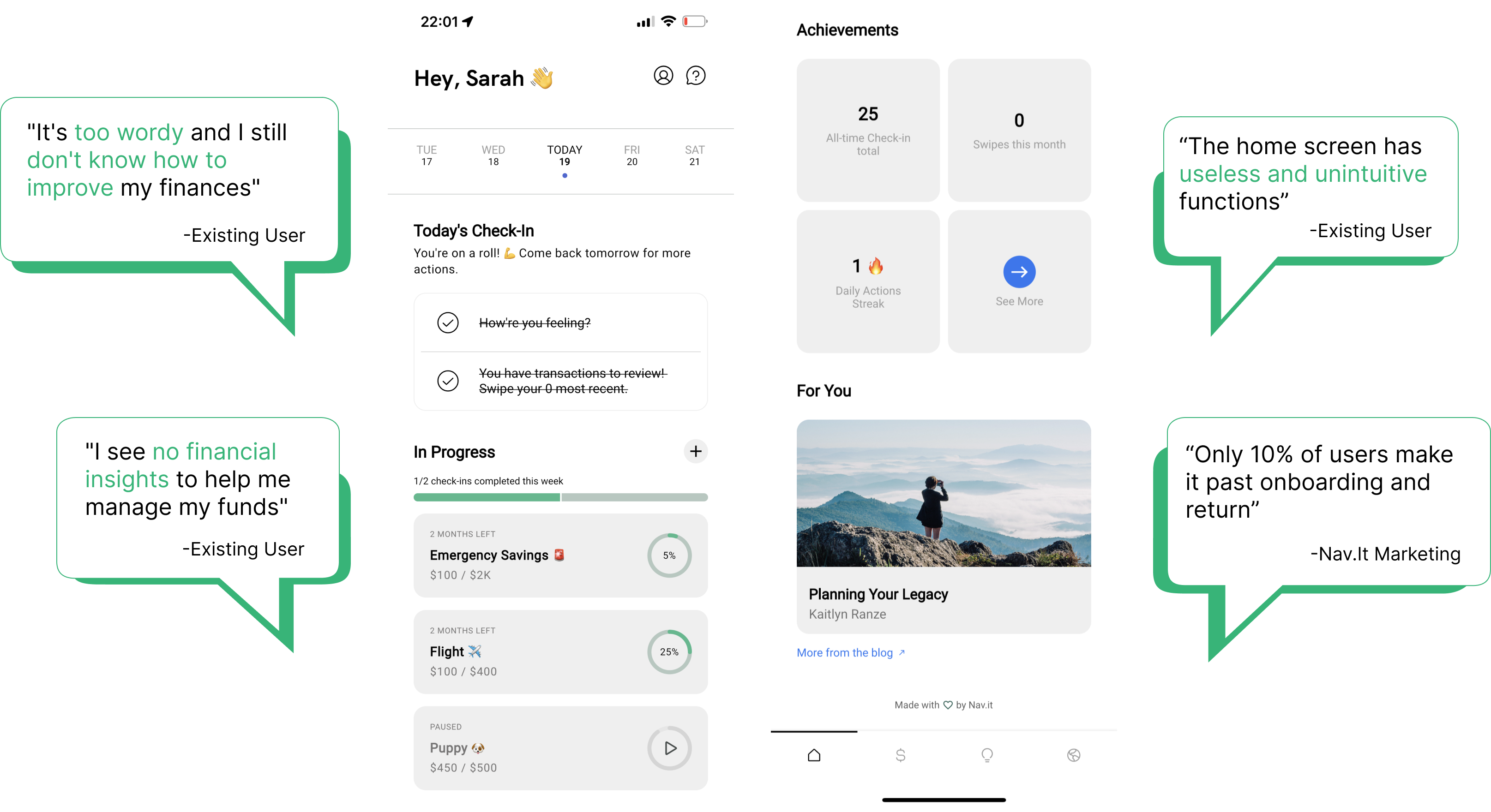
Most users associate negative feelings towards their finances and feel unconfident and dissatisfied with their financial status and management methods.

Competitive audit
I researched competitors gathering essential features and flows that make a financial management app successful.

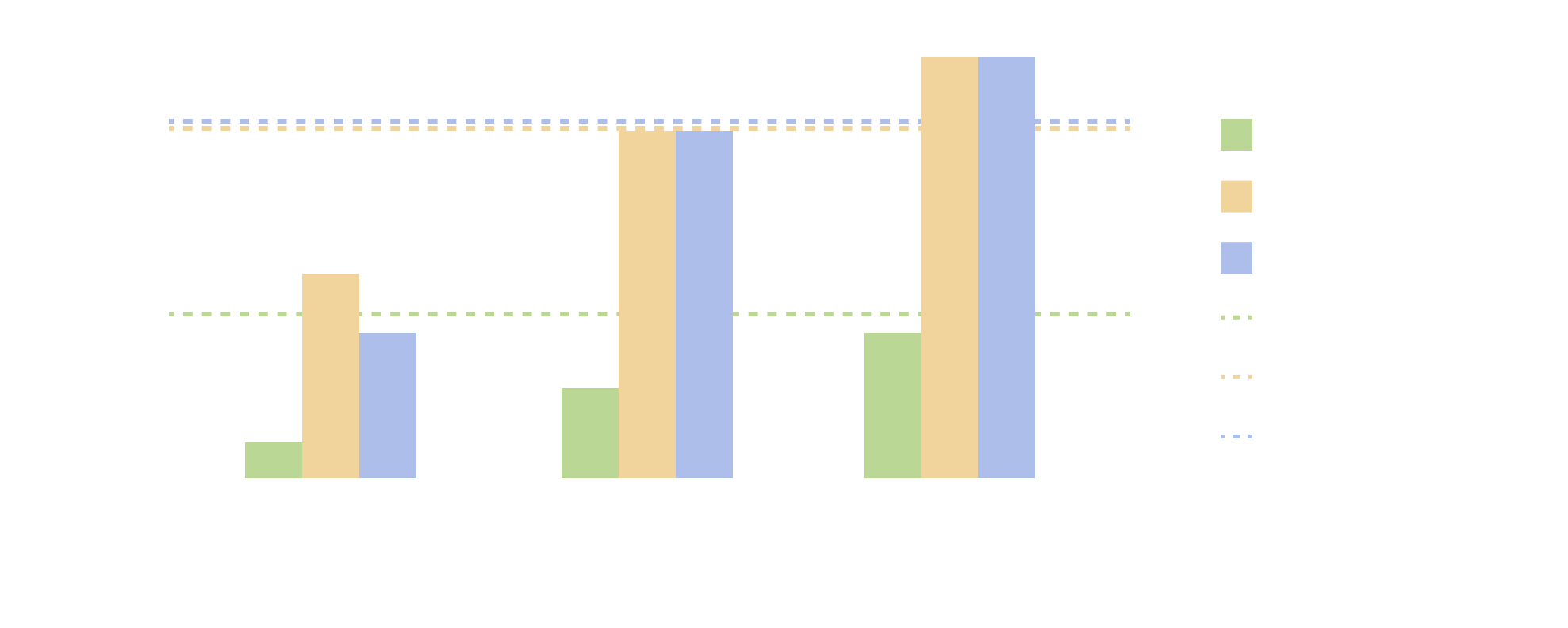
Additional successful user engagement analysis:
With further research looking at published studies, . Gamification will help Nav.It stand out from competitors to be approachable, educational and helpful in increasing user financial wellness and confidence for young adults.
Opportunities
1.
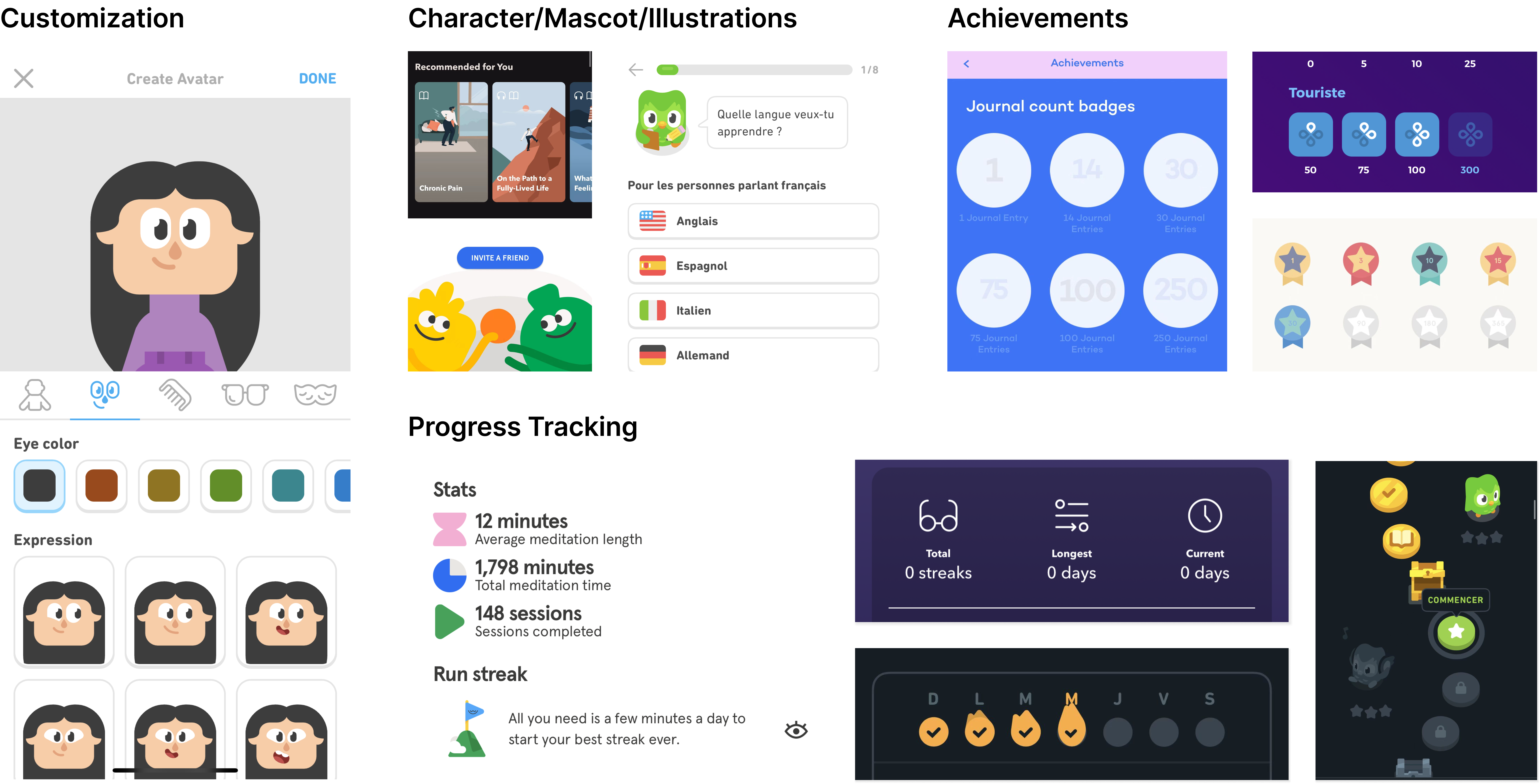
Visual optimization
Visual optimization
2.
Progress tracking
Progress tracking
3.
Incentivization
Incentivization
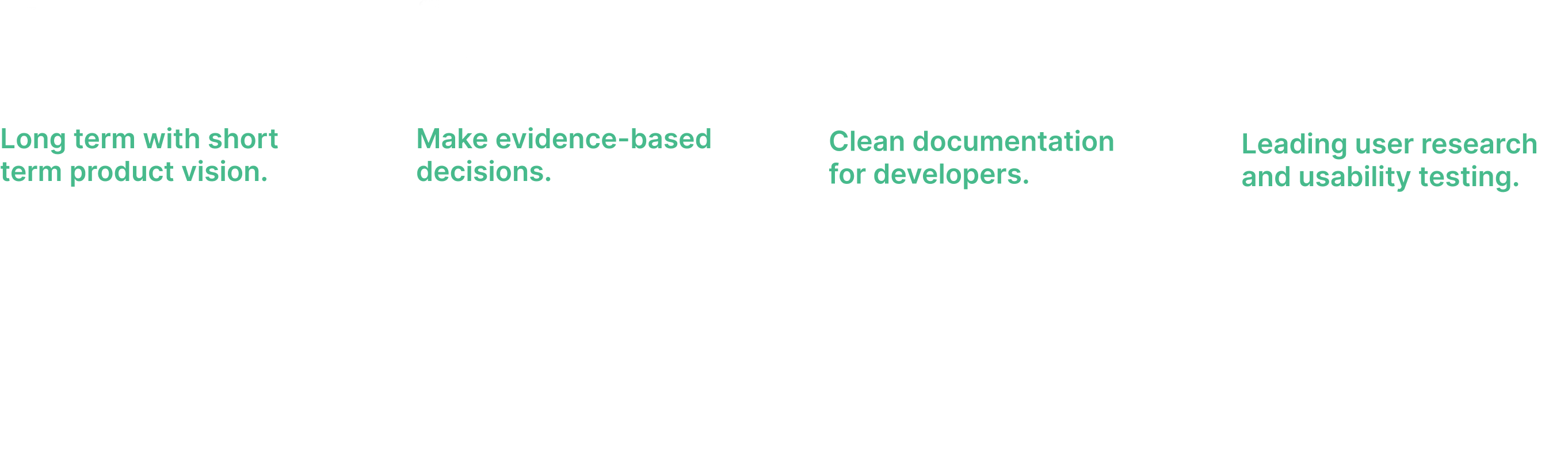
Task hierarchy
Building habit and confidence
Rewards and themes
Redesigning the current home screen
Nav.it needed to make a strong initial impression on users, fostering trust and increasing engagement. The current design was confusing for users.
Iteration and feedback
Visual optimization exploration
Progress tracking exploration
Incentivization exploration
What do users value?
1. Simplicity
Providing maximum guidance whilte requiring miminimal user effort
2. Sense of accomplishment
Motivating users by rewarding and showing progress

Financial journey guide
Users indicated guidance to be helpful.
Financial journey
Users liked seeing the list of tasks they completed / have yet to complete and see their plants grow as they progress through different levels.
(Note: Financial content advised by Nav.It Finance Expert)
(Note: Financial content advised by Nav.It Finance Expert)
Mindfulness journey:
watering goal guide
Users can track trends between mindset states and spending habits.
Watering goal level up
Increase in users confidence when they reach their goals and level up.
Journey map
Track user progress.
Achievements
Increase in user confidence.
Show off achievements
Customization and instills a sense of accomplishment.
KPI impact
Retention, onboarding, acc. connectivity rate increased by 100-150%.